A scatterplot is a graph that represents bivariate data as points
on a two-dimensional Cartesian plane.
Example 12
The following set of data values was observed for the height h (in
cm) and weight w (in kg) of nine Year 10 students.
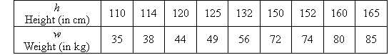
Plot a scatterplot for this set of data.
Solution:
The scatterplot is obtained by plotting w against h, as
shown below.
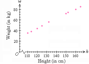
We use the scatterplot to look for patterns that might indicate that
the variables are related. Then, if the variables are related, we
can visualise what kind of line (or curve), or equation, describes the
relationship.
Association (or Relationship)
Association (or relationship) between two variables will be
described as strong, weak or none; and the direction of the association
may be positive, negative or none.
In the previous example, w increases as h increases.
We say that a strong positive association exists between the
variables h and w.
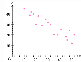
Consider the following scatterplot:
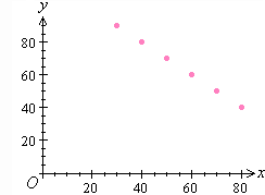
It is clear from the scatterplot that y decreases as x increases.
We say that a strong negative association exists between the
variables x and y.
Consider the following scatterplot:
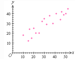
We observe that y increases as x increases, and
the points do not lie on a straight line. We say that a weak positive
association exists between the variables x and y.
Consider the following scatterplot:
We observe that y decreases as x increases, and the
points do not lie on a straight line. We say that a weak negative
association exists between the variables x and y.
Consider the following scatterplot:
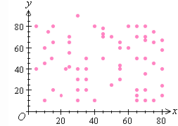
It is clear from the scatterplot that as x increases,
there is no apparent effect on the y. In such a case, we say
that no association exists between the variables x and y.
Consider the following scatterplot:
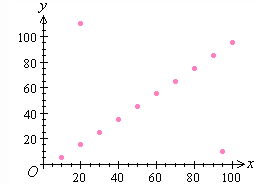
If a data value does not fit the trend of the data, then it is said to
be an outlier. In the above scatterplot, it is easy to
identify the outliers. There are two outliers in the set of data values.
Key Terms
scatterplot, association, relationship |